The Fork

Art·Words·Design

Ideas people want a bite of.

A creative trio

Three senior creatives, one shared table. We turn sharp insights into brands and campaigns that leave people craving more.

Three tines. One fork.

The Fork is a creative trio. An art director, a copywriter and a design director, each with their own studio and two decades of award-winning work for brands around the world.

We work as one team, from first insight to final craft, between Portugal, Brazil and the rest of Europe.

The trio

Each tine does its part

The Art Tine / left

Sávio Hatherly

Visual imagination with creative vision behind it.

A Brazilian-Portuguese creative director based in Portugal, Sávio is the founder of ShiftLab&You, a creative lab that conceives its own ideas and brings others’ to life. He’s an independent Art Director with over 20 years of experience across Brazil, New York and Europe.

His award-winning career spans projects for agencies and brands worldwide, alongside jury roles for Cannes Lions UK and Young Lions Asia. He combines production craft with AI tools to turn fresh ideas into visual stories that leave your customers craving more.

  • Art direction
  • Craft & AI
  • ShiftLab&You

The Words Tine / middle

Eduardo Balestra

Eduardo gives The Fork its voice.

An independent Creative Director and Copywriter with 17 years at some of the most acclaimed agencies in the world, Edu has created award-winning campaigns for brands such as Persil, Burger King and Volkswagen.

Used to working on the other side of the counter, he led the creative department at Gorillas, delivering more than 20 campaigns in less than a year while making a tight budget go further. A psychology student, UGC comedy creator and creative consultant for startups, he looks for the subtlest insights and turns them into ideas people want a bite of.

  • Copy
  • Creative direction
  • Insight
edubalestra.com

The Design Tine / right

Aurelia Fontana Giusti

The Fork’s eye for detail and design.

Franco-Italian by origin, Brazilian by choice and international by nature, Aurelia is the founder and Design Director of TROPICAL, an independent creative studio based in São Paulo, Paris and Milan. Working across branding, visual identity and art direction, she builds distinctive brand worlds that bring strategy and creativity together.

She loves connecting unexpected references and challenging conventions. For Aurelia, design is how brands think, speak and make people feel. It’s all about taste, quite literally in this case.

  • Branding
  • Visual identity
  • TROPICAL
studio-tropical.com

Work

A taste of what we’ve made

Pull up a chair.

Tell us what you’re cooking. A brand, a campaign or a half-baked idea, we’d love to hear it.

Say hello

dudubalestra@hotmail.com

01 / Branding & Design

Sapore di Sale

  • Branding
  • Packaging
  • Social

Italian tradition, with a twist.

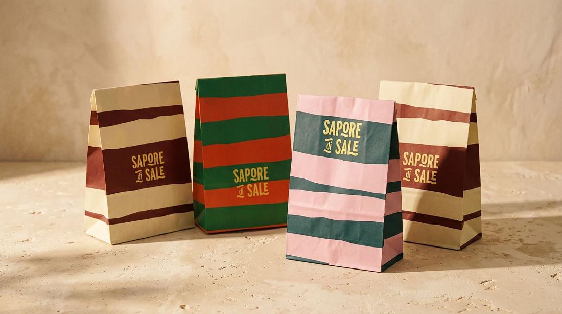
Sapore di Sale brings artisanal lasagne and the pleasure of Italian cooking into everyday life. TROPICAL developed the brand from strategy and visual identity to packaging and digital communication, building a distinctive world inspired by Italian food culture and the rituals of sharing.

Sector
Food
Services
Brand strategy, visual identity, packaging design, art direction, digital communication
Deliverables
Brand strategy & brand sprint, visual identity, packaging design, art direction and digital communication. Applications included lasagne packaging, shopping bags, branded apparel, branded merchandise and digital content.
Sapore di Sale striped delivery bags

How do you give tradition a fresh taste?

Sapore di Sale needed an identity that celebrated Italian food culture without falling back on predictable visual codes.

The challenge was to combine the warmth of homemade cooking with a distinctive personality that could stand out on the shelf and beyond.

Lasagna packaging sleeves
Sapore di Sale Instagram grid

A little Italian, a little unexpected.

The brand sprint established the foundations of a food brand rooted in quality, pleasure and sharing. We translated these principles into a visual direction that balances Mediterranean warmth with a contemporary, expressive attitude.

Sapore di Sale enamel pin collection

One logo. A whole visual language.

Expressive typography, bold stripes and unexpected colour combinations form a flexible graphic system, giving the brand a consistent identity across different formats.

Delivery bag close-up
La Lasagna enamel pin

Good food deserves a good entrance.

The identity extends across lasagne packaging, shopping bags, branded merchandise and digital content. Colour, stripes and expressive typography create a recognisable system across every application.

Sapore di Sale t-shirt

Made to be shared.

From the first strategic explorations to the final applications, Sapore di Sale shows how a clear brand idea can shape every point of contact.

A distinctive identity, designed to make Italian food culture feel fresh, familiar and full of character.

02 / Branding & Design

The flavours of TROPICAL

  • Packaging
  • Lettering
  • Editorial

A taste of TROPICAL

What if a creative identity could be experienced beyond the visual?

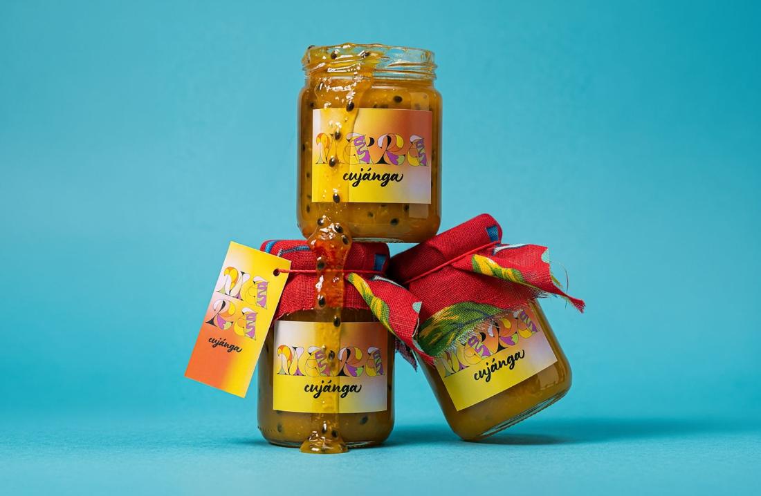
Created for our own studio, Maracujánga and Papayaê are two original jam recipes that bring the TROPICAL universe into taste, colour and texture.

From concept and naming to packaging and art direction, the project translates our creative identity into a tangible experience.

Sector
Art & Design, Food
Services
Concept & strategy, packaging, graphic design, visual identity
Deliverables
Product concept, original recipe development, naming, packaging design and art direction for Maracujánga and Papayaê jams.
Maracujánga jars stacked on teal

How do you turn a visual identity into something you can taste?

The idea was to take TROPICAL beyond the screen and into everyday life.

We created two original recipes, each with its own name and personality, using the products as a new way to express the studio’s approach to creativity, design and Brazilian-inspired flavours.

Maracujánga jar and zine
Papayaê jar and zine

Two flavours. Two personalities. One TROPICAL universe.

Maracujánga brings together mango and passion fruit.

Papayaê combines papaya, tangerine and passion fruit.

Distinct in flavour, the two recipes share an expressive visual language that connects their names, ingredients and packaging to the identity of TROPICAL.

Open Maracujánga jar on teal
Passion fruit jam dripping from a spoon
Hand holding a Maracujánga jar
Jars on tiles, top view
Fruit market bag with jars

A visual identity you can take home.

Bold colours, expressive typography and playful naming give each jar its own personality while keeping both within the same visual system.
Arms full of jars
Spoons of jam
Toasts with jam
Papaya sticker against the sky

03 / Branding & Design

Concreta

  • Type design
  • Lettering
  • Posters

A typeface cast in concrete.

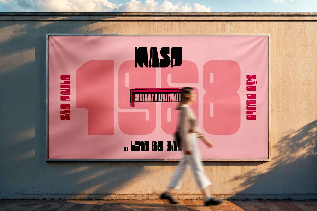
Concreta is a display typeface inspired by brutalist architecture. Its heavy, geometric letterforms borrow from the raw concrete of buildings like MASP and SESC Pompeia in São Paulo, Torre Velasca in Milan and the Biblioteca Nacional in Buenos Aires.

Sector
Type design
Services
Typeface design, lettering, graphic design
Deliverables
Display typeface, architectural posters, stickers, magnets, tote bags and t-shirts.
Concreta typeface identity
MASP 1968 poster

Built from buildings.

Each letter takes its structure from concrete: thick slabs, sharp cuts and generous counters. The result is a typeface that feels heavy and playful at the same time.

Concreta letters over SESC Pompeia
Concreta letter over a concrete building
Concreta letters over SESC Pompeia’s red walkways

From the street to the fridge door.

Stickers, magnets, tote bags and t-shirts take Concreta off the page and into everyday life, wherever a little concrete feels right.

Mamma Mia sticker held against the sky
Stickers on a classic car
Magnets on a vintage fridge
Xuxu tote bag
Concreta t-shirt

Posters with a skyline.

A series of architectural posters puts the typeface next to the buildings that inspired it, from MASP in São Paulo to Torre Velasca in Milan and the Biblioteca Nacional in Buenos Aires.

MASP poster on a street wall
Biblioteca Nacional Buenos Aires poster
Torre Velasca poster

Video not loading? Watch on Vimeo ↗